Client project · Coesfeld
Vito Immobilien
Client project · Real estate · Coesfeld
- Industry
- Real estate
- Location
- Coesfeld
- Project type
- Website rebuild
- Scope
- Design, build, mobile-first
Starting point
Vito Immobilien covers three areas: property management, a caretaking service, and letting and selling from its own portfolio. The existing website did not keep those areas apart. Anyone opening it had to work out from running text which one they needed.
The structure had accumulated over the years rather than being planned: content sat side by side with no discernible order, and the contact details were a long way down. On a phone the site was barely usable.
There was also a detail about the business that the site never made visible: selling and letting happen exclusively from its own portfolio, and it does not act as a conventional estate agent. Anyone who does not know that sends the wrong enquiry.
Goal
The three areas needed to be distinguishable at a glance, and the distinction from conventional estate agency work needed to sit in the first screen rather than on a subpage.
Prospective clients needed to be able to get in touch on any device without a detour — in writing or by phone, whichever suits them.
Requirements
The first meeting produced the points the design was measured against:
- The distinction from conventional estate agency work has to be unmistakable.
- Properties, property management and the caretaking service each need their own place in the navigation.
- Phone and form stand side by side as equals; not everyone writes.
- The site stays understated and does without sales language.
- News and local sponsorship have to be maintainable without rebuilding the home page.
Approach
In a first meeting in Ahaus we sorted the content together: what belongs to property management, what to the caretaking service, what to the company's own portfolio? Only then did the navigation take shape. The design was drawn mobile-first and agreed with the client before the build started.
Information architecture
The navigation follows what visitors come for rather than how the company is organised internally. Alongside the home page it leads to six areas:
- Properties — the company's own portfolio, as its own area rather than a section
- Property management — the service that needs the most explaining, so it gets its own page
- About us — the people the opening image also shows
- Sponsorship — local commitment, deliberately kept apart from the services
- News — content that changes without touching the structure
- Contact — last in the row and additionally a button in the header
On a phone
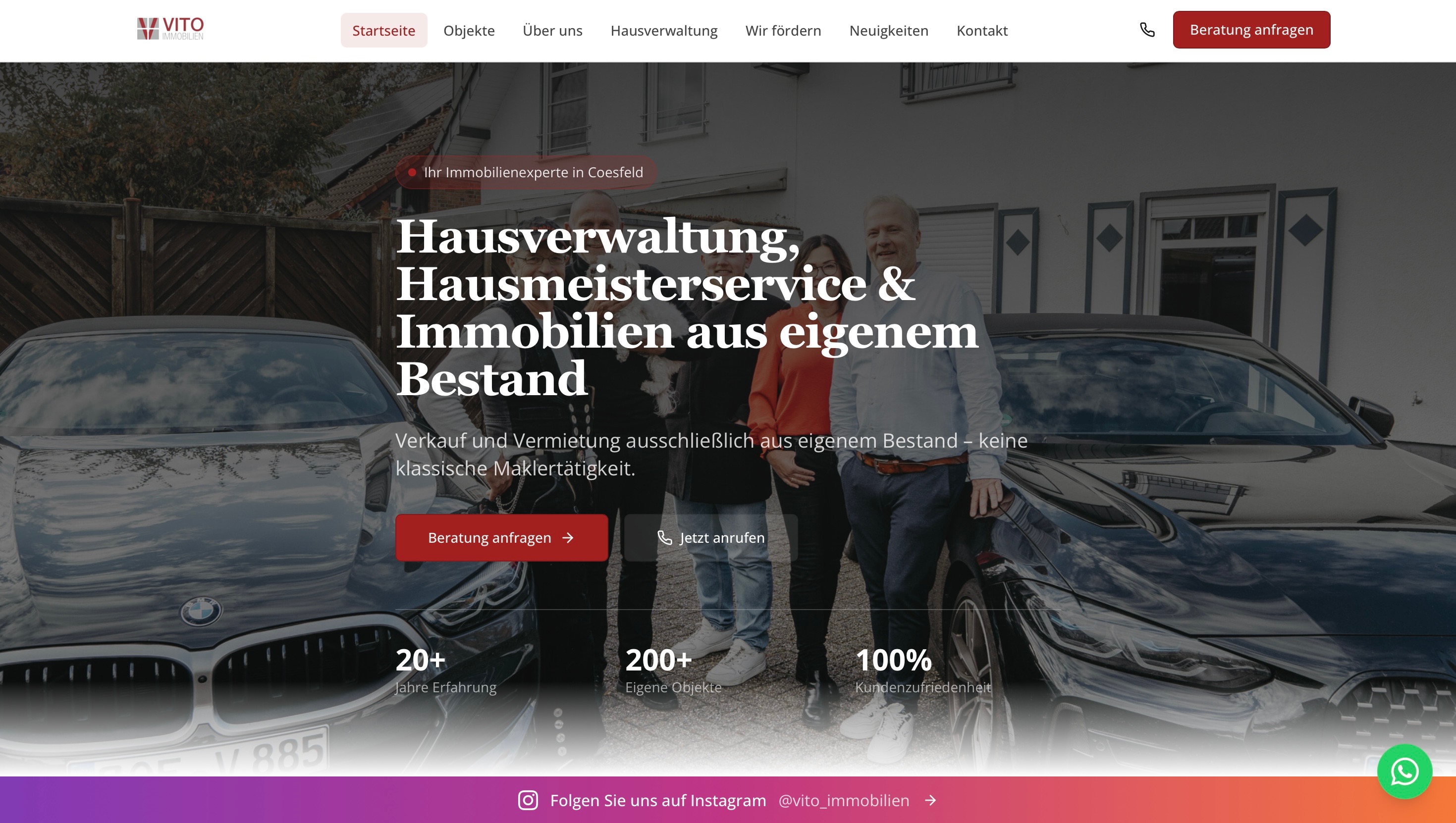
The design was drawn at phone width first, and that decides what goes at the top: the headline naming the three areas, the distinction in one sentence, then the two ways to get in touch. The imagery starts below that. The phone number is its own button, because from a phone a call is a shorter route than a form.
Design decisions
The opening image shows the team in front of their own vehicles rather than a stock property shot — the business is known locally, and the faces are the evidence. Headlines are set in a serif and body text in a quiet sans; the red from the logo is reserved for the main action, so the most important button does not compete with anything else. The figures below the opening image are the company's own statements and appear as such, not as a measurement by us.
Build
The agreed structure was built with understated imagery and clear typography that lead to the contact form. On top of that came the technical groundwork: loading behaviour, readability and handling on a phone, plus a title and description for each page. A WhatsApp contact and the company's Instagram channel are embedded without crowding out the main routes.
Handover and running it
Before going live we went through the site together to check that the content and the structure make sense without explanation. The domain is registered in the company's own name, as it is on all our projects. After launch we stay reachable as the point of contact.
After launch
Anyone opening the site today sees in the first screen which three areas the business covers and that it does not act as a conventional estate agent. From there a call and a form lead straight to the company, on a phone just as on a desktop.
Whether that produces more enquiries is not something we can measure from the outside, so we do not claim it. What can be shown is that the route from the home page to getting in touch is shorter than it was, and that visitors no longer have to guess what the business does.
Project scope
- Concept and information architecture
- Design in the NovaWeb design language
- Mobile-first build
- Structuring the three service areas
- Clear routes to phone and form
- Technical groundwork
- A title and description for each page
Next step
Your website project
Send us your website and what you would like to change. We will review the project and reply personally.
Request a website project